Decision pattern
What the buyer actually had to decide.
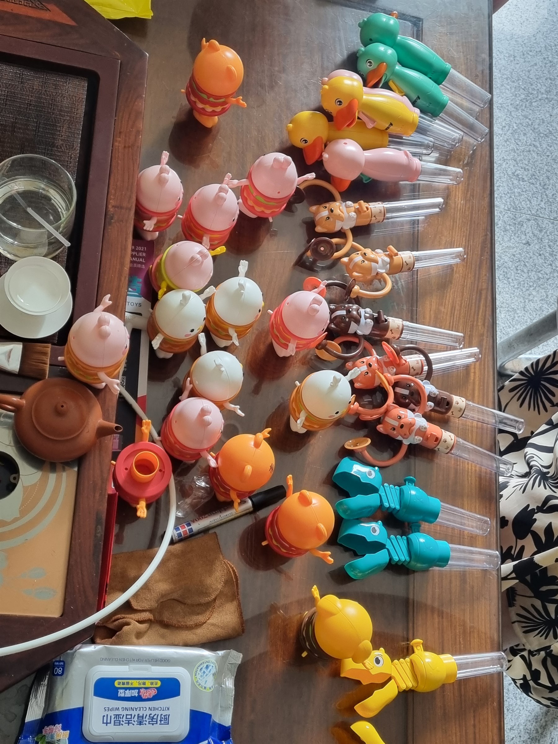
Specialty buyers often lose money by being almost right. The product concept is good, the supplier is real, and the quote seems workable, but the final item does not quite feel premium enough once it sits next to stronger store merchandise. That was the exact risk here. The buyer did not need more options. They needed fewer, better-proven options.
Buyer problem
The category looked commercially promising, but the buyer knew the decision would live or die on perceived value. Supplier thumbnails made almost everything look sellable. The real issue was whether blister finish, print density, and peg-read would still feel premium enough to support a specialty-store price once the products were physically in hand.
Inflection point
The decision changed once packaging quality was treated as economics instead of aesthetics. A slightly cheaper item that reads inexpensive on peg is not actually cheaper if it collapses the store's price credibility. The winner was the tighter assortment that could defend the shelf tag without apology.
Decision
Treat packaging finish as a core buying variable, cut the opening assortment from fourteen concepts to four, and make a physical sample review the non-negotiable approval gate before any opening PO.
Why this path won
This path let the buyer protect the premium shelf signal the store depends on. Instead of pretending all quote-sheet winners were equal, it forced the purchase decision to be earned by the products that actually held up in hand and on peg.
Let packaging decide the go / no-go
The sample review became the approval gate because finish and perceived value were inseparable from margin.
Start with one rack-worthy set
The opening display focused on the four SKUs most likely to feel intentional together instead of broad for the sake of breadth.
Preserve the right to widen later
The rest of the assortment stayed available, but only after the pilot proved that the shelf story was strong enough.
Why it mattered
Assortment breadth fell, shelf confidence improved, and the opening buy became easier to defend.
Thumbnail deception
Most supplier images made the category feel safely viable, but thumbnails hide weak print density, cheap blister texture, and underwhelming shelf presence.
Premium price pressure
The store could command a good ticket only if the product looked giftable in person. A small packaging miss would have hit conversion immediately.
Too much breadth too early
A wide opening assortment would have spread the buy across mediocre options instead of letting the strongest designs actually read as winners.